AksDark: My colorscheme for KDE Plasma
Hey all, just a simple blog post this time, I just wanted to showcase the colorscheme I have made for KDE Plasma and various text editors and such.

I have been working on this colorscheme for many months now, slowly tweaking it and figuring out what are the best colors for me.
I think I've finally found what works for me the best.
About the name: I am bad at naming things and I just first felt like "Okay only I use this colorscheme so I just name it AksDark lol" and well seems some people like it a lot!
Why
Okay, yes, it's silly to write about history of why I made a colorscheme besides "it looks cool" but hear me out, there's an actual reason!
I have tried a lot of dark colorschemes, but they often share this one thing that does not work for me:
Low contrast.
My eyes are in weird place where too high contrast hurts, but too low contrast just doesn't help readability at all and I get easily distracted. I think my ADHD adds to it as well!
I couldn't for the life of me find a colorscheme that has vibrant colors but also not too dark background. Even Catpuccin, while good looking, has just too much pastel for me, and the purple background just bothers me in general.
I would love to rename AksDark to something else and have similar project for it like Catpuccin is! Email me or talk to me on Fediverse if interested :D
With pastel colors, the colors arent distinct enough and when I read things, I keep jumping from place to place, since it doesn't "lock" my eyes. I do not know any science behind this.
I wanted something very neutral, but vibrant. These sound like they're odds with each other, but I think they can be made work.
What
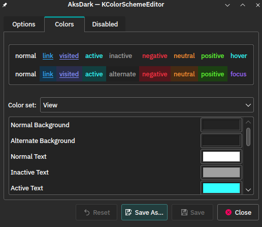
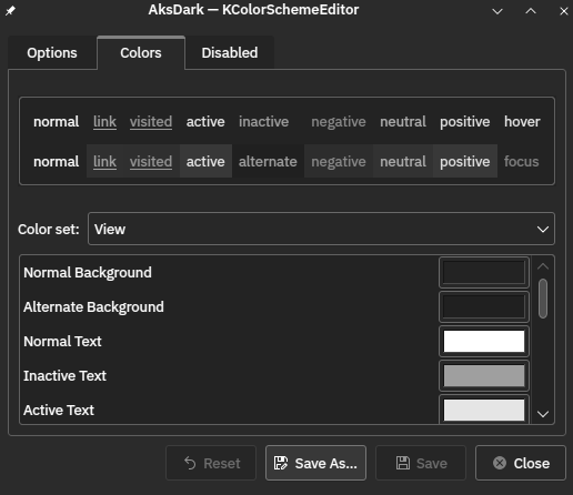
AksDark comes with dark-gray background, but all the elements are vibrant and high color. I tried to keep the luminosity of the color values very similar, so in black and white mode one can still look at the text and see what's going on.

As you can see the colors are pretty distinct in b/w mode, however it seems link and visited colors could use some tweaking. Of course one has to remember that different monitors can display them differently and so on.
The contrast is purposefully high, but not too high. The gray background ensures that eyes do not hurt when looking at the bright text, but it still is bright enough to lock my view and help me concentrate.
How
I just trial-and-error'd it. I tried even darker background color but that ended up getting my eyes tired. I tried less bright text etc. colors but that just made me distracted easily, avoiding the "eye-lock."
What I got now is pretty much perfect for my needs.
The most helpful tool with this was definitely Themer.dev! One can easily make their own colorschemes with it. However, the biggest problem with it is that, for example, syntax highlighting will always look different between applications. So it will require a lot of manual tweaking in the end, which is what I spent most of my time doing.
Other apps
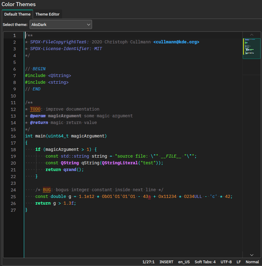
Since I really like this colorscheme, I made a Kate style for it too:

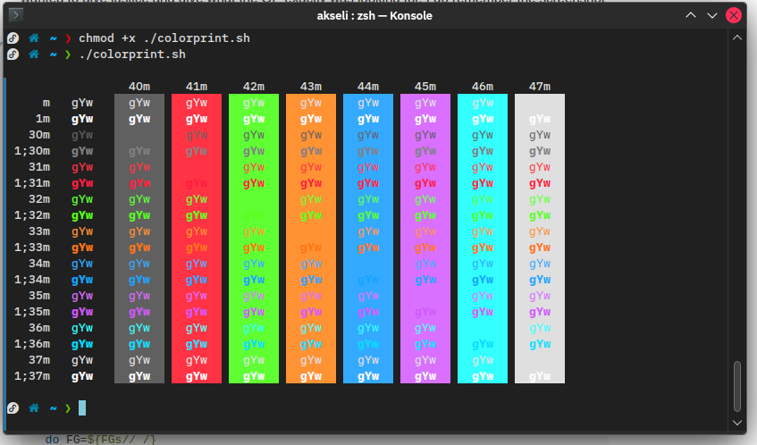
And Konsole

There's colors for other apps like VSCode and Jetbrains IDE's in my repository: https://codeberg.org/akselmo/aks_themes
However they may not be as up-to-date.
Outline plasma theme!
Last but not least, if you use the default Breeze window decoration with this colorscheme, this Plasma theme is also default Breeze, but with similar outlines. Having outlines on my Plasma theme helps me a lot (I dont get lost in sea of windows), so maybe someone else will find it useful too: AksDarkPlasma
Also remember that you can download all these themes and styles from the "Get more new stuff" menus in KDE Plasma!
That's all, I hope you like the colorscheme and find it useful as well, if your eyes and/or brain are just as weird as mine!
Tags
Webmentions
Have you written a response to this post? Send me the URL!
Can't load webmentions! You have likely javascript turned off.