I made outlines for KDE Breeze window decoration
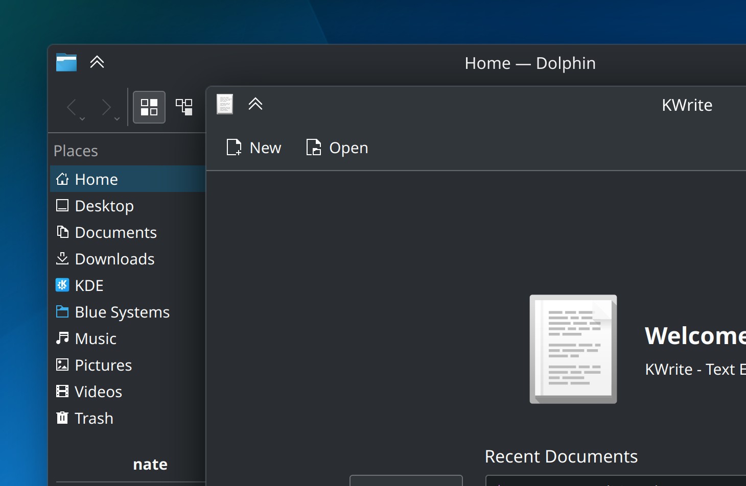
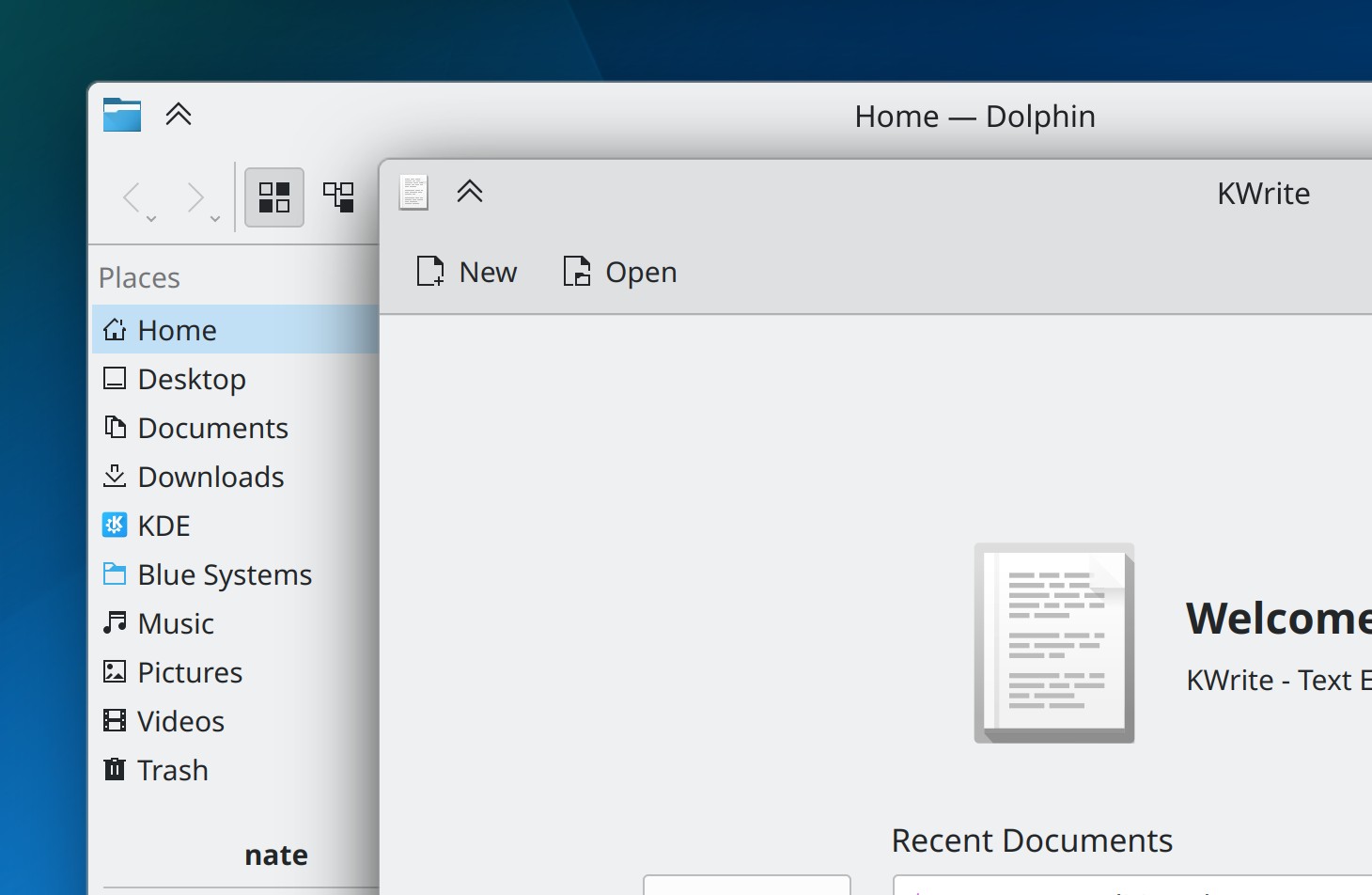
Window outlines! Yet another KDE contribution by yours truly! This was fun. Not easy at all, but fun. I'm pretty happy how they turned out.
Breeze Dark
Breeze Light
I hope Nate you don't mind me taking the screenshots from your blog post, I'm just.. Lazy. I have no excuse. Lol.
For those who just want to see how it's made, here's link to the merge request: https://invent.kde.org/plasma/breeze/-/merge_requests/241
Also I am probably gonna make couple LOTR references due to talking about binding and light and dark and I'm sorry about that beforehand.
But why make them?
I have big problem making distinctions between windows if they have dark theme and on top of each other. Window shadows are often dark as well, so the windows just kind of blend into each other and the shadows do not help much. Disable shadows altogether and you got windows that just disappear into each other. This can even happen with light themes, sometimes the shadows just are not enough.
They also look a bit better with the outlines, in my opinion. They give some kind of "constraint" for the window and they ease my weird brain.
To sum up, it just makes the windows feel like they're their own entities which calms my brain, they look nice and they stop windows from blending into each other.
Where are they drawn?
First I had to figure out where the hecc I draw these outlines?
Well, I wanted to make them their own thing, separated completely from other elements. But this would've meant I would need to actually make more in-depth modifications to KDecoration (I think?) and make the outlines their own draw calls and whatnot.
So instead, I made them play nice with shadows. Basically, the outlines are just part of the shadow drawcall.
But what happens if shadows are disabled?
Something cheeky happens! I actually draw the shadows with 0% alpha channel!
    CompositeShadowParams params = lookupShadowParams(m_internalSettings->shadowSize());
    if (params.isNone()) {
        // If shadows are disabled, set shadow opacity to 0.
        // This allows the outline effect to show up without the shadow effect.
        params = CompositeShadowParams(QPoint(0, 4), ShadowParams(QPoint(0, 0), 16, 0), ShadowParams(QPoint(0, -2), 8, 0));
    }
So the shadows are always there, they're just invisible. But the outlines will show up.
Hold on, you could've just skipped drawing shadows entirely!
Yes, but actually no.
Before shadows are even drawn, they make some very very useful calculations for me. And on top of that, remember that outlines are part of the shadow drawcall. Outlines are just one more colored part of the shadow, basically.
No shadows, no outlines. In darkness together, I've bound them.
Bordering madness
I get it all look nice and fancy with borders, they look all nice and rounded on bottom border... And then I disable borders.
And everything looks off.
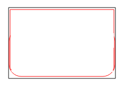
The bottom border disappears completely and leaves a sharp window edge. The outline then rounds behind the window. It looks bad!!!
So, if borders are disabled, we do a magic trick and draw the outline path on our own.
    // Draw window outline
    const qreal outlineWidth = 1.001;
    const qreal penOffset = outlineWidth / 2;

    // Titlebar already has an outline, so move the top of the outline on the same level to avoid 2px width on top outline.
    QRectF outlineRect = innerRect + QMarginsF(penOffset, -penOffset, penOffset, penOffset);
    qreal cornerSize = m_scaledCornerRadius * 2;
    QRectF cornerRect(outlineRect.x(), outlineRect.y(), cornerSize, cornerSize);
    QPainterPath outlinePath;

    outlinePath.arcMoveTo(cornerRect, 180);
    outlinePath.arcTo(cornerRect, 180, -90);
    cornerRect.moveTopRight(outlineRect.topRight());
    outlinePath.arcTo(cornerRect, 90, -90);

    // Check if border size is "no borders"
    if (borderSize(true) == 0) {
        outlinePath.lineTo(outlineRect.bottomRight());
        outlinePath.lineTo(outlineRect.bottomLeft());
    } else {
        cornerRect.moveBottomRight(outlineRect.bottomRight());
        outlinePath.arcTo(cornerRect, 0, -90);
        cornerRect.moveBottomLeft(outlineRect.bottomLeft());
        outlinePath.arcTo(cornerRect, 270, -90);
    }
    outlinePath.closeSubpath();
This part was actually fixed by Noah Davis: https://invent.kde.org/plasma/breeze/-/merge_requests/241#note_541478
So, uh, I'm not 100% sure what's going on here but it seems that:
- Draw a rectangle with top left and top right with an arc, since they're always rounded
- Check if we have border on or off
- Draw bottom corners with an arc if borders are on, or draw sharp lines if they're off
I think I got it right..? But I can say, my solution was more messy and I'm glad it's not there. It involved basically blending two rectangles together. This is much better!
Outline colors!
The biggest puzzle of this was actually how to get the color for the outlines. We could have just gone with basic black and white coloring here, but it would be too much contrast in some situations and look jarring to some.
So I started with a simple idea: Take the background color of the window, then light or dim it based on its lightness value (HSL). If lightness is equal or over 50%, then dim the color. Otherwise lighten it.
At first I used HSV, which caused a bit weird situations. In HSL, lightness is basically how much the color is lightened or darkened, but in HSV, the value dictates how the color acts under light. For this situation HSL was better since we're not playing with lighting values, but just want to know if the color is "dark" or "light" to our eyes.
Anyhow, here's some copy-pasta from the source files:
    auto s = settings();
    auto c = client().toStrongRef();
    auto outlineColor = c->color(c->isActive() ? ColorGroup::Active : ColorGroup::Inactive, ColorRole::TitleBar);

    // Bind lightness between 0.1 and 1.0 so it can never be completely black.
    // Outlines only have transparency if alpha channel is supported
    outlineColor.setHslF(outlineColor.hslHueF(),
                         outlineColor.hslSaturationF(),
                         qBound(0.1, outlineColor.lightnessF(), 1.0),
                         s->isAlphaChannelSupported() ? 0.9 : 1.0);
Hold on, you said background color of the window, but you're using titlebar color?
When using the background color ColorRole::Frame the problem is that when having colored titlebar, the outline color feels
very out of place. It just doesn't look good.
But using ColorRole::TitleBar we get a fun colored outline effect when having a separately colored titlebar!
Also there's the whole qBound(0.1, outlineColor.lightnessF(), 1.0) thing. Like the comment says, if the lightness value is black or very dark,
the outline will also be black or very dark. Binding the lightness avoids situations where the outline
blends into the dark background color.
And of course, finally we check if transparency is enabled and set it accordingly to avoid awkward situations.
But colors are tricky. Some like this solution, some don't. I am probably going to make a drop-down setting where people can select does the outline use background or titlebar color, or are they just off.
Continuous Iteration
My part was done and the outlines got merged! It was long long long ride and I learned a lot. But I'm super happy I managed to do this part, now it just needs to be iterated on so we can get something that looks The Best.
Nate Graham already made the colors pop a bit more by fixing the lighten/darken values: https://invent.kde.org/plasma/breeze/-/merge_requests/263
Also there was initially a feature that if the window color was super light, we just didn't show outlines at all due to the outlines being so dim it created a weird blur effect as the outlines were gray, the shadow black and the window white. But with this tweak that doesn't need to be done anymore.
There's still probably work to be done on this, but the biggest hurdle seems to be over! Knocks on wood
As I said, I may make the settings section for this, but we'll see. I need a short break from KDE contributions, I got my own projects to work on too lol.
There's also been talk that we could use the separator (the | thing that separates buttons in menus etc etc) color as the outline color, and make that separator color
modifiable. I think that would make A Lot Of Sense... But I would still keep the outline color as the titlebar color if the titlebar is colored. :)
Thanks!
Thanks for reading this ramble. I really enjoyed making this contribution and once again I learned A LOT. Open source contributions are great way to learn new stuff and I'm happy I get to make stuff like this for KDE. Also I've learned I kinda enjoy writing C++!
And thanks for all the comments and feedback and code reviews and everything anyone did to help me get this outline thing through. Based on the feedback I've read on Da Internets, this is something many people didn't realise they needed!
Tags
Webmentions
Have you written a response to this post? Send me the URL!
Can't load webmentions! You have likely javascript turned off.


