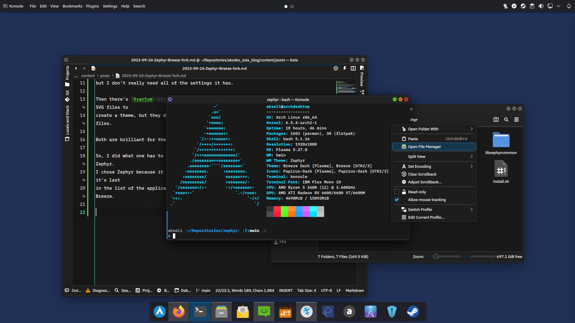
Zephyr - My Breeze fork
I had the hankering for tinkering the KDE application style. The default style by KDE, Breeze, is pretty nice as is, but there are small things I'd like to modify.
There's Klassy which is quite customizable and fun, but I don't really need all of the settings it has.
Then there's Kvantum which uses SVG files to create a theme, but they don't follow KDE colorschemes. And I dislike working with SVG files.
Both are brilliant for their usecases, but I wanted just Breeze with few changes.
Fork time!

So, I did what one has to do, forked Breeze and renamed everything Breeze related to Zephyr. I chose Zephyr because it was synonym for Breeze in Thesaurus lol. Also, it makes sure it's last in the list of the application styles, so people don't accidentally confuse it to Breeze.
Here's link to the repository: https://codeberg.org/akselmo/Zephyr
Installation help is also there, but feel free to make issue and/or merge requests for adding stuff like what packages one has to install for their distro.
Unfortunately due to the massive size of the Breeze Gitlab repo, I didn't want to flood Codeberg with the whole history. So, some of the history got lost. I have mentioned it in the readme file though.
After renaming all the things, the whole thing built and installed surprisingly easily.
I then implemented following:
- Black outline setting, so the default outline has a black one around it.
- Why? Idk looks cool. Not really other reason.
- Yes, it can be disabled.
- Traffic color icons in window deco
- I am allergic to Apple but the traffic light concept just makes sense to me.
- Also can be enabled or disabled
- Customizable style frame and window deco outline colors
- You can completely change the frame colors.
- You can also make them invisible! No outlines, no frames! Fun!
- Slightly rounder windows and buttons
- At some point I will make a setting for these too, but now they're applied when the thing is built
- Fitting Plasma style if you use the defaults Zephyr offers (mostly black outlines)
- The plasma theme buttons do not match the application style in roundness, yet.
- I am lazy and avoid working with SVG files as long as I can
Why
For fun! For learning! And I wanted to make something that is super close to Breeze (hell, it is Breeze, just few mods), but still has it's own charm and how I like seeing my desktop.
It also can work as a great test bench for others who want to see if they can modify application style.
Just rename anything Zephyr to YourForkNameHere and have fun. But it's probably better to fork the original Breeze project :)
Also, when making my own things for Breeze, it's nice to just implement them in something similar but different name so I can test the changes for longer period of time. And if I like the changes I can maybe show them to upstream.
In future, I will make it work with Plasma 6 (unless i feel lazy). Probably will have to fork Breeze then again and apply my changes. Hopefully it's not too big of a change.
Also, I will be working on the actual Breeze in future too! I hope to implement separator colors for the Plasma colorscheme, so basically you can change the color of all frames and outlines and whatnot. This kinda helped me to figure how that works as well!
All in all, good project, I keep tinkering with it and it helps me understand the Breeze styling and Qt in general more.
Revontuli and Zephyr
My colorscheme Revontuli works really well together with Zephyr. So, feel free to give them a go!
Thanks for reading as usual!
Tags
Webmentions
Have you written a response to this post? Send me the URL!
Can't load webmentions! You have likely javascript turned off.